About Me
My name is Jeroen Rood, and I am currently a B1.2 student at Industrial Design. With this website I showcase my progression in my studies.
Ever since I learned how to draw, I liked it. Making drawings was part of my pastime. Next to that, I always had a fascination for toy cars and later on for cars. One day, I started drawing cars, which I thought was really cool. At secondary school I took Art Class, which I enjoyed quite a lot.
Now I am studying Industrial Design, and I really see myself becoming a designer once I finish these studies. Since I like to draw cars, I ultimately like to become a car designer. Although that might be a bit ambitious, one has to have goals. But right now I am looking at other branches of design. Who knows what I might find interesting!
Vision
My view on design is that whatever you design, it has to be simple. Form follows function. In my opinion, there has to be a logical relationship between the design and the function. I don't like it if there are too many frills. Mostly, products which are the simplest to handle, which have the most intuitive interactions are considered the best of their kind. This is true for webdesign as well. When a visitor has to navigate through too many submenus or extra pages and navigations, the website is regarded as poorly designed.
I think the same is happening in real product design. Where Apple products are designed to be as accessible as possible, with a genuine and intuitive look and feel, other companies seem to focus more on being different. The head of Industrial Design at Apple, Sir Jonathan Ive thinks successful industrial design is about being genuinely better instead of being different.[1] I always had an iPod Touch, which is great to use. With an industrial design point of view, I look with a certain fascination to Apple products.
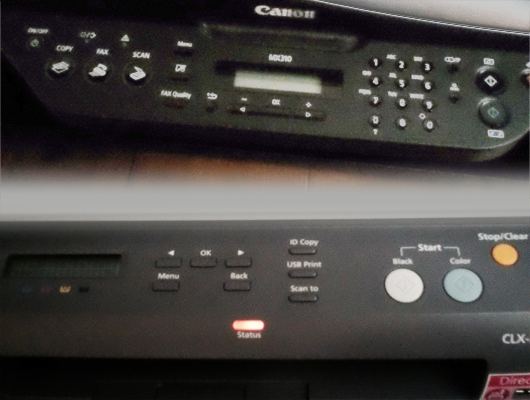
I think a good product has to give the user a good experience. The up-rise of easy-to-use consumer electronics shows that the products which do give a good experience are the most successful. Apple has made a head start here, but the rest is catching up. Still, there are many fields of products that still are too technical-focused. They build a product technically, and in the end design the user interface. I think that is not the best solution. It is a common problem with for example printers that their users are constantly frustrated about the difficulty of printing or copying documents. Designing the printers on a more user-centered way would definitely solve this irritation problem.
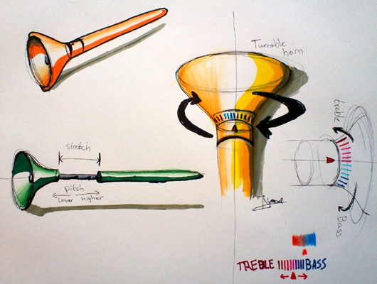
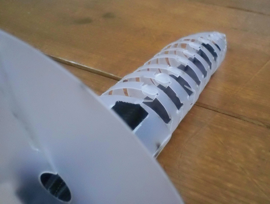
I like it if a product is as simple as possible. One should not need to press extra buttons to follow a logical order of functions. Looking back to the development of my concept, "Ge-Oor", I started with a strong, but very basic concept. While I was going through the design process, I added more features, and as a consequence more ways of interacting with the device. This quite weakened the whole concept. Now that I built a prototype based on the basic interaction, I am convinced that a product should be as simple as possible. I don't want to end up with a product which resembles a can-do-it-all Swiss army knife. Less is more. And as the shape communicates it's function, I think the same is true here.
Identity
This year I started as a "car freak", to put it that way. I changed slightly to that respect. I still admire classic as well as some new car designs. Though, I started to focus more on Industrial Design, following trend websites as well as design website journals. Besides, I love designing websites and have been following web design trends as well as UI-trends ever since.
I like it when products or services work intuitively. The easier, more streamlined and the more personal, the better. Looking at products, I think it is important to let these products build a certain relationship with the user, where impersonal button-mashing is avoided by using other ways of interacting or using other materials than just plastic or other textures than just plain glossy. Looking to services, there is more room for computed messages that appeal to the user. When the user should be alerted, it should be done in a friendly way. Besides, the user should be approached friendly and enthusiastic, leaving no room for confusion.
But still I think there is no denying I have a passion for car design. Though, this semester I didn't spend that much time with car design. That doesn't mean I didn't follow the developments in car design, but I wasn't actively engaged with it. I was more focusing on the design world next to car design. I developed some competencies which can come quite handy when it comes to car design, so I am eager to apply the knowledge and skills I learned to car design in the holidays.
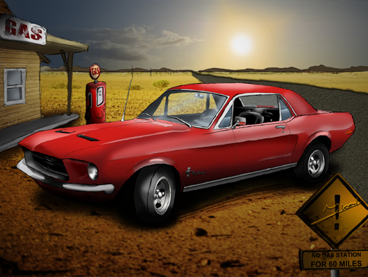
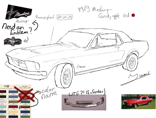
Though this semester I did draw cars. My neighbours wanted me to draw their old Mustang. They had to get rid of it, but only had a few pictures of it. I decided to make a digital drawing, so it could be expanded to a 120x80 canvas. It also meant that I could use my drawing tablet, getting a better feeling for drawing with it. It did help me when it comes to that. I also had a mini-research process, because the pictures they handed me were only of mediocre size and quality. I had to do some research for the different details that I couldn't really define from the grainy pictures.